ORERI
- Resolution
Minimum 300dpi
Maximum 600dpi- Max Paper Size
320 x 420mm
- Max Printing Area
413 x 291mm. If the print requires cutting and registration marks, the final format will be smaller.
- Text
All texts must be vectorised and transformed into paths before export. Texts are best readable when printed in one colour, minimum size 5pt. White texts on a coloured field read well from 8pt. If you send greyscale PDF files, set texts smaller than 12pt in registration (rich) black and texts 12pt or larger in 100% (pure) black.
- Opacity
It is inadvisable to print areas with uniform ink coverage at 100% opacity, especially large areas. Except in rare cases, they will be desaturated to 80%. It is also advisable not to put areas of solid ink too close to the page margins, especially the top one. In general, try to avoid them.
- Transparencies
Flatten transparencies and effects before exporting. The Riso may convert areas that appear blank on the screen in unpredictable ways.
- Multiply
When two areas of ink overlap, it is possible to make the colours merge, creating a third colour, or to "pierce" the colour on the lower layer, keeping the two colours pure. In this case, it is possible to create threads of white between the two colours. You can find the "multiply" function in the "transparency" panel in Illustrator or Indesign, and in the "layers" panel of Photoshop.
- Tyre Marks
When printing on sheets that have already been printed, the rubber wheel that transports the sheets into the machine can become soiled with ink and leave slight marks on the sheets. To reduce this risk, avoid printing areas with a lot of ink near the top edge of the sheet. Most of the time these marks are unavoidable, but can easily be removed with an eraser.
- Page Marks
If you include crop marks on the PDF you export, make sure the offset is between 3 and 5mm. Remember that crpo marks and other page marks reduce the size of the final file, as the maximum print area stays always the same.
- Bleed
If you print bleed-trimmed images, leave a 5mm bleed beyond the edge of the page. This allows us to trim prints without leaving white areas in the margins.
- Safety Margins
To be safe, leave a 5mm margin from the edge of the page and any important part of your design
- Safety distance
To be on the safe side, leave a 5mm distance between the important parts of your design and the edge of the page. The less space there is between the edge of the page and the printed elements, the more obvious any inaccuracies will be.
- Spot Colours
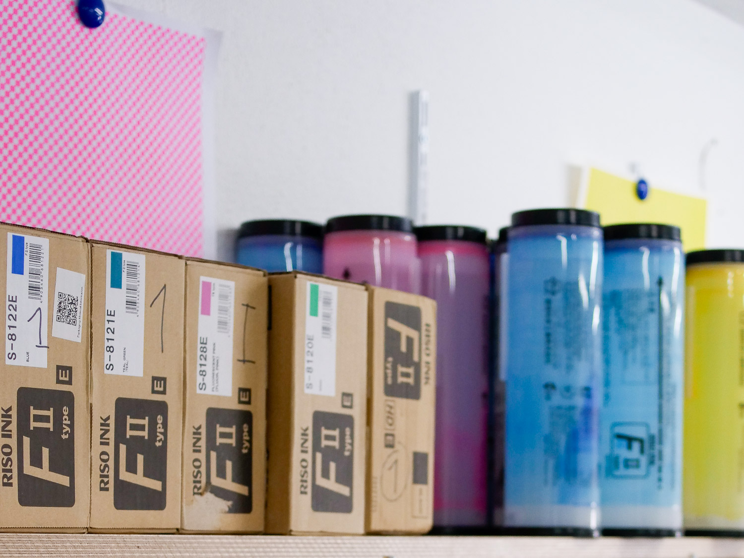
Remember that risograph printing uses special spot colours: in your file, use the corresponding Pantone colour to characterise the objects or channels you want to print in that colour from the initial stages of the job. If you want to obtain colours that are not available in our catalogue, you should allow for overlaps between layers.

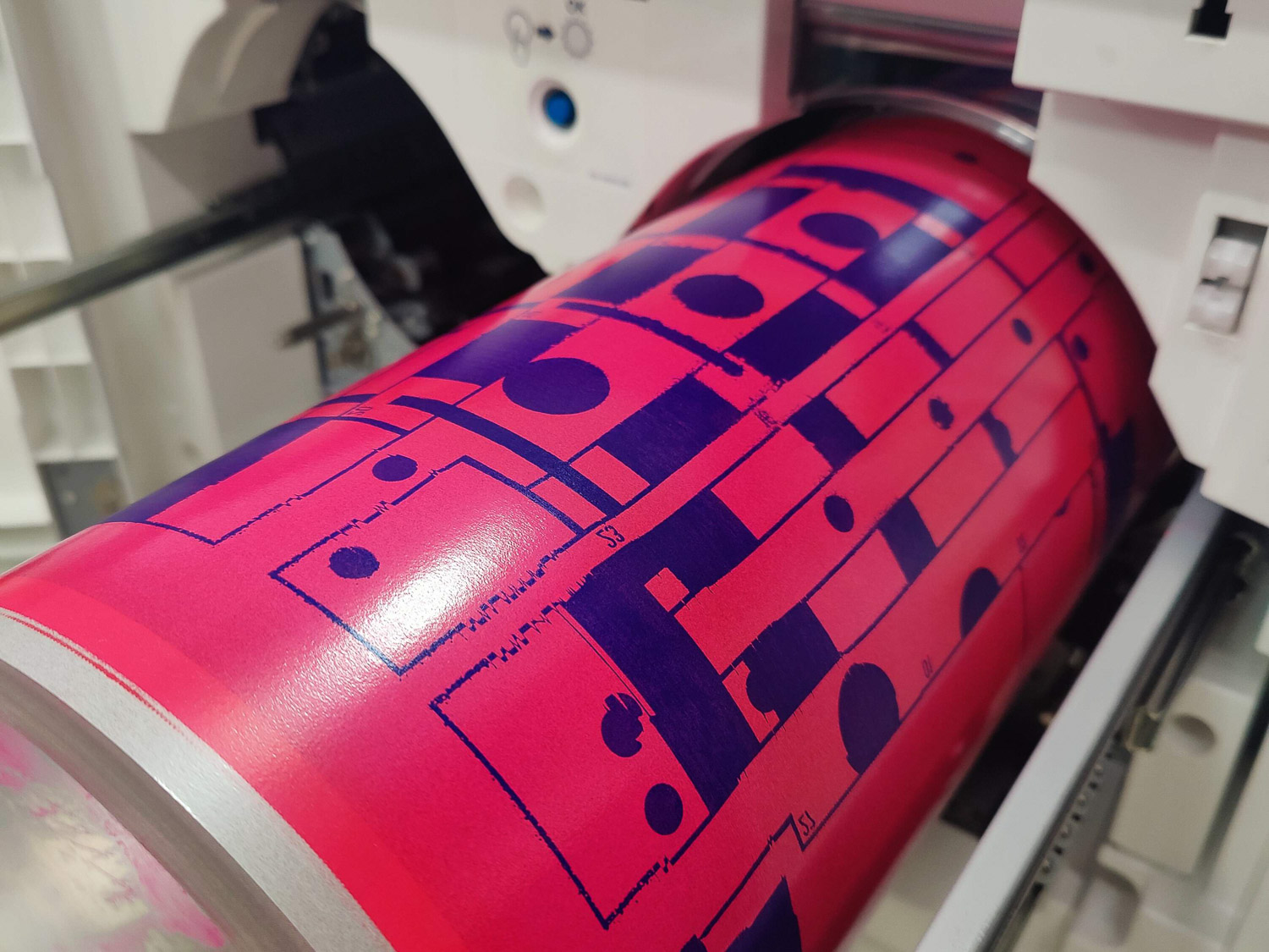
To get an idea of how risograph printing works, just think of screen printing. As in this technique, each colour is printed individually: to obtain a multi-colour print, several layers must be superimposed. The Riso creates a perforated matrix from a greyscale file, the black parts of which are printed with the ink in the cylinder used to print that file. Your file should then have a series of easily separable layers, as many as the number of colours you want to print. Generally, you don't need more than 3 or 4 colours to get visually rich prints: this printing is at its best when you take full advantage of the overlaps between colours, shading and depth.
The Riso prints with spot colours that are not available in Adobe programmes, and we recommend that you use the Pantone (or hexadecimal) codes that you can find on the Machines and Techniques page in order to have a more or less accurate preview of how the print will look.
If you need guidance, at this link you can download a set of InDesign and Illustrator templates that you can use to prepare your files, with ready-to-use Riso colours and basic instructions. You can send us your files in various formats: you can export a series of greyscale PDFs, named with the colour you want to print, and include a colour JPEG in the folder for reference; or a PSD file (Photoshop) with separate layers, one for each colour; or an AI file (Illustrator), in which all objects and texts of the same colour are grouped on the same layer (in which case be careful of transparencies and overlapping effects between objects). Do not send TIFFs, JPEGs or PDFs in colour (unless they are already set with spot colours), as we cannot print them. If you are working with illustrations on paper, the process is a little more complex, and we suggest you contact us so that we can work out together how to carry out colour separation in order to achieve the best result for your project.
If you want to print a book, a fanzine, or a project to be bound, we prefer to receive the InDesign package with the fonts and PSD files (or PDF with spot colours already set up), and proceed with the export ourselves.
If you have any doubts, please contact us. We can give you advice or do the prepress work for you. In the case of particularly complex work (e.g. channel separation, spot colour assignment, image correction), we may charge an extra fee. For further technical details please see the table on the side. You can send us your files to stampa@oreri.ooo.
